

Quick Start Guide
A quick overview of the Numerics user interface.
Getting Started with Numerics
Numerics is a comprehensive business dashboard software designed to help you design, track, and communicate your Key Performance Indicators (KPIs). The software connects with over 80 SaaS tools, apps, and spreadsheets, allowing you to create a central hub for all your relevant metrics and KPIs. You can customize your Numerics dashboard by adding widgets, share the dashboard template, or start a collaboration.
Anatomy of a Dashboard
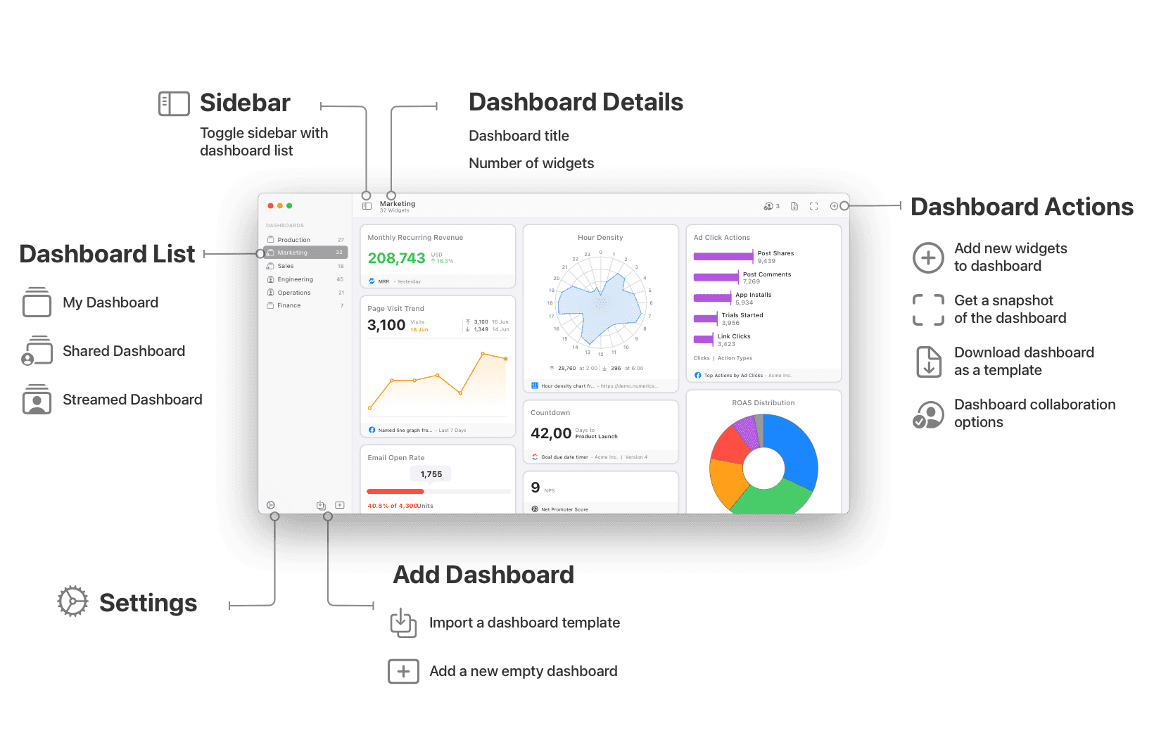
A Numerics dashboard is your command center, where you can view all your relevant KPIs and metrics in one place. It's a customizable space where you add widgets to create a personalized snapshot of your business data. With a dashboard, you can share the template or start a collaboration, providing a holistic view of your business metrics. Here are the key elements of a Numerics dashboard:
Widgets: These are tiles that display various forms of data. You can add as many widgets as you need to your dashboard.
Dashboard Sharing: You can share and collaborate on KPI dashboards with others using secure iCloud sharing & Collaboration for Messages. You can also share your dashboard as a template with others, facilitating team members to track key metrics.
Customization: You can rearrange widgets, customize colors of visualizations or add logos/images as per your preference to create a dashboard that suits your needs.
Anatomy of a Widget
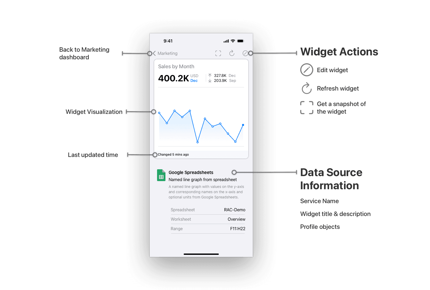
Each dashboard displays tiles known as widgets. Numerics supports 11 different types of visualizations – Label, Number, Number with Change, Line Graph, Named Line Graph, Pie Chart, Top List, Gauge, Countdown Timer, Hour Density, and Day Density charts. You can have an unlimited number of widgets in a single dashboard. Here are the essential elements that compose a widget in Numerics:
Widget Title: This is a user-defined field that allows you to name your widget. We recommend using descriptive names that reflect the data you're tracking. This will make it easier for you and your team to understand what each widget represents at a glance.
Visualization: Based on the KPI widget template you choose, data will be represented using one of the 11 types of visualizations. Each visualization type displays data in a unique manner, facilitating various perspectives and interpretations.
Data Source Information: Numerics can connect to over 80 different SaaS tools, apps, and spreadsheets. The Data Source area, shows the icon of the service from which the data originates. Also included is the name of the widget as defined in the app, along with additional related information about the source, like the project or views and timespans that you have chosen to visualize the data from.
Widget State: This section provides real-time information about your widget's status. It informs you if the widget is currently refreshing, if there has been an error, and when the data from the service last changed. This feature ensures you have the most accurate and up-to-date information, maximizing the impact of your data-driven decisions.
Where you can use Numerics
On which devices can I use Numerics?
Mac
iPad
iPhone
Apple Watch
Apple TV
On which devices will Numerics NOT work?
Windows
Android
Linux
the Internet (through a web browser)
any non-Apple device
Support
If you encounter any issues or have any questions while using Numerics, please refer to our extensive documentation or reach out to our support team for help.